Card
Todo
- elaborate on guidelines
- add accessiblity guidelines
Variants
There are two different variants for the cards: normal (horizontal) and a compact (vertical).
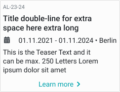
Card list (horizontal)
These cards work well on larger screens or for enriched view of a table list.
Example is the course card as horizontal list card.
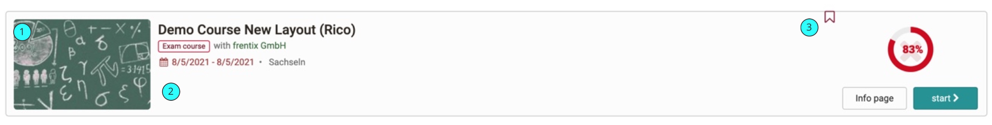
- Course Image: Absolute size of max. 240x120px. Gets shrinked when not enought space is available.
- Course Information: Space for course information. All Information gets displayed in vertical order.
- Progress and Actions: Space for Course Progress, if booked. Also the 2 action buttons are here.
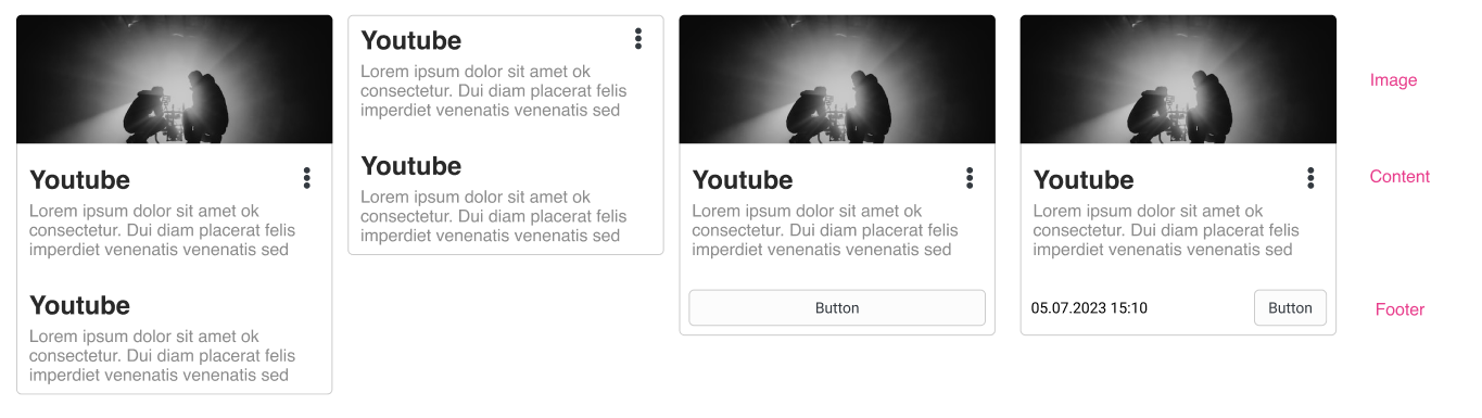
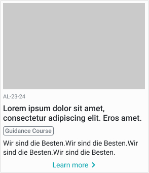
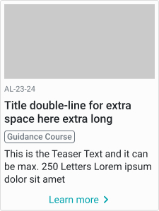
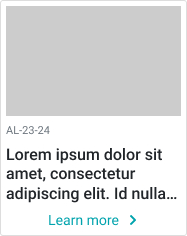
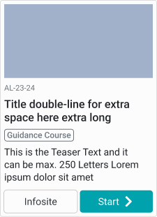
Card compact (vertical)
These Cards are found in badges / media center / catalog.
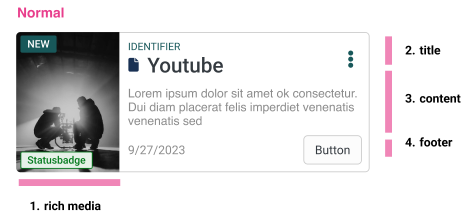
Shematic example of a card
| desktop | tablet | mobile |
|---|---|---|
 |
 |
 |
| with 2 buttons | without image | |
 |
 |
Card compact horizontal
The compact card can also be flipped into horizontal.
Classes
This is just an entrypoint, not an complete list.
Course Card /List Card
.o_coursetable.o_rendertype_custom .o_table_row .o_repo_entry_list_item {

}
Compact Cards:
%o_card,
.o_card {
   &:hover {
 }
}
General Guidelines
Behaviour at different screen sizes
The cards have a fixed width set in percentage.
Mobile, smaller than
Should span the whole device width.
When to use
Display a single, concise group of content within a set of similar, related content. For example a list of courses, different groups.
When not to use
If we need a high information density or you need to compare data, the table view is a better choice.
Alignment
Except for Buttons and the personal learning progress the content is right aligned.