Card
Todo
- elaborate on guidelines
- add accessiblity guidelines
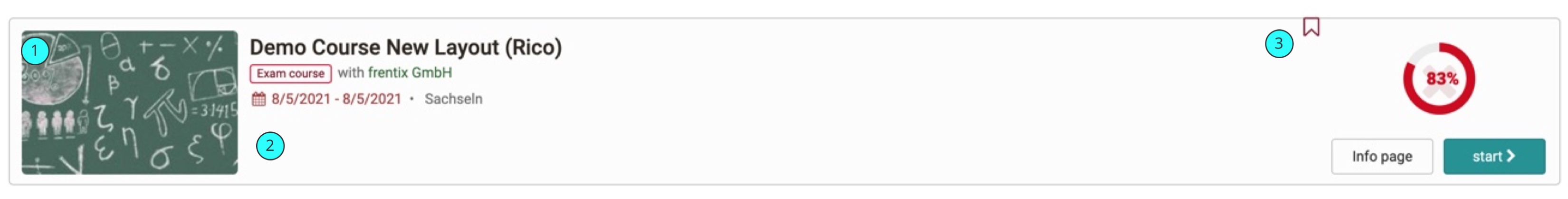
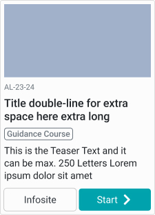
- Course Image: Absolute size of max. 240x120px. Gets shrinked when not enought space is available.
- Course Information: Space for course information. All Information gets displayed in vertical order.
- Progress and Actions: Space for Course Progress, if booked. Also the 2 action buttons are here.
Variants
There are two different variants for the cards: normal (horizontal) and a compact (vertical).
Course Card (horizontal)
These cards work well on larger screens or for enriched view of a table list.
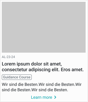
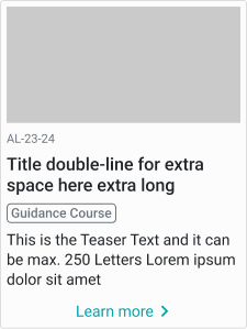
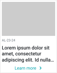
Course Card compact (vertical)
| desktop | tablet | mobile |
|---|---|---|
 |
 |
 |
| with 2 buttons | without image | |
 |
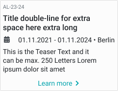 |
A Variant currently in use in Catalog only. Smaller with less information (minus: course progress, duration, place).
Guidelines / Usage
When to use
Display a single, concise group of content within a set of similar, related content. For example a list of courses, different groups.
When not to use
If we need a high information density or you need to compare data, the table view is a better choice.
Alignment
Except for Buttons and the personal learning progress the content is right aligned.
Accessibility
--
Last update:
2022-06-03