Tips and tricks for authors
We use the Material theme for MkDocs. For a complete reference and inspiration please consult:
The following are a list of things we use commonly:
Admonitions
Tip
This is an admonition
See the list of supported types / icons and styles
Details
Details are the same as admonitions but expandable / collapsable. Use Just use ??? for initially collapsed and ???+ for initially opened details. Use the same image classes as with the admonitions
Info
Also available as collapsable items. Just use ??? instead of !!!
See the pymdown extension page to learn how this works in detail.
Links
Links to other pages from the manual are written as relative links to the corresponding Markdown file. Make sure you reference the correct language! Just review other pages, you will find many examples.
[External link to frentix.com](https://www.frentix.com)

[Internal link to the group section](../../manual_user/groups/Using_Group_Tools.md)
In-Page references Just use
Add {: #anchor-example} to any title element to create an anchor that can be referenced by other pages or in an external link. Make sure you use the same anchor name for all languages of the same page.
[Link to the tables section in this page](#tables)

[Link to the courses section in a different page](../../manual_user/groups/Group_Administration.md#courses)
Downloads
Downloadable files such as PDF can be written as standard Markdown link. Some JS code will automatically add a target to open the file in a new window instead of replacing the current page.
Supported types are pdf, odt, xlsx, docx.
If the download is represented with an image, the image tag can be embedded into the link tag. This is a bit cumbersome, but works well. See the example below
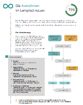
[{ class="thumbnail-xl border"}<br>whitepaper_learning_path_courses_en_final.pdf](assets/whitepaper_learning_path_courses_en_final.pdf)
Images
Image styles and css classes can be added to the image markup like this:
{ width=100px align=right class="border shadow" }
Important
The following notation to add special parameters to images is extremely sensitive to whitespace! Make sure 1. between the image markup und the left curly bracket is no space 2. after the left opening curly bracket and before the closing right curly bracket there is one space Otherwise the image styles will not be applied.
Sizes
There are some predefined image sizes that can be applied by assigning CSS classes. Use technique preferably over manually adding width or height:
| CSS class | Description | Example |
|---|---|---|
size16 |
shrink to match 16x16px | |
size24 |
shrink to match 24x24px | |
size32 |
shrink to match 32x32px | |
size48 |
shrink to match 48x48px | |
size64 |
shrink to match 64x64px | |
thumbnail-sm |
shrink to fit 150x100px | 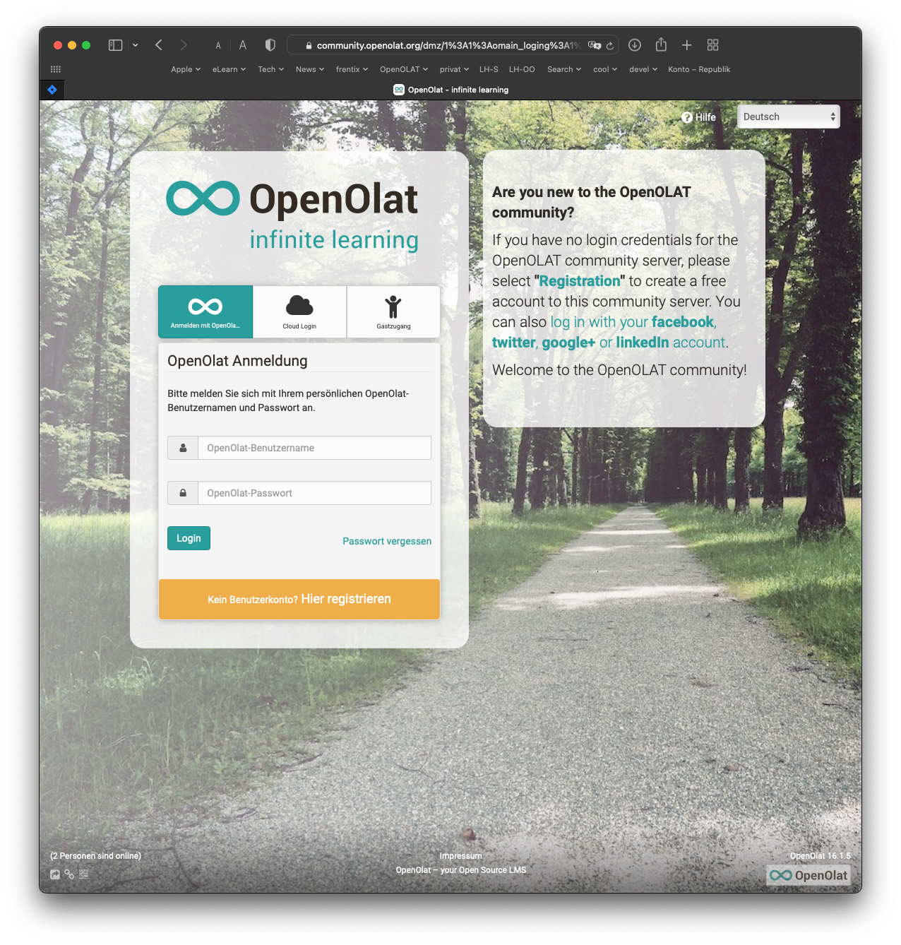 |
thumbnail |
shrink to fit 250x150px | |
thumbnail-lg |
shrink to fit 300x200px | |
thumbnail-xl |
shrink to fit 400x300px | |
Aside images
Sometimes it is handy to have all images in the same width displayed at the right side. For this purpose we have the aside classes.
Aside classes behave respsonsive, meaning the images get smaller if there is not enough space on the screen
Info
Note that aside images must be placed before the content.
| CSS class | Description | Example |
|---|---|---|
aside-right-sm |
shrink to fit 150px width | |
aside-right |
shrink to fit 250px width | |
aside-right-lg |
shrink to fit 300px width | |
aside-right-xl |
shrink to fit 400px width | |
{ class=aside-right }
Lorem ipsum dolor sit amet, consetetur sadipscing elitr, sed diam nonumy eirmod tempor invidunt ut labore et dolore magna aliquyam erat, sed diam voluptua. At vero eos et accusam et justo duo dolores et ea rebum. Stet clita kasd gubergren, no sea takimata sanctus est Lorem ipsum dolor sit amet. Lorem ipsum dolor sit amet, consetetur sadipscing elitr, sed diam nonumy eirmod tempor invidunt ut labore et dolore magna aliquyam erat, sed diam voluptua. At vero eos et accusam et justo duo dolores et ea rebum. Stet clita kasd gubergren, no sea takimata sanctus est Lorem ipsum dolor sit amet.
Lorem ipsum dolor sit amet, consetetur sadipscing elitr, sed diam nonumy eirmod tempor invidunt ut labore et dolore magna aliquyam erat, sed diam voluptua. At vero eos et accusam et justo duo dolores et ea rebum. Stet clita kasd gubergren, no sea takimata sanctus est Lorem ipsum dolor sit amet. Lorem ipsum dolor sit amet, consetetur sadipscing elitr, sed diam nonumy eirmod tempor invidunt ut labore et dolore magna aliquyam erat, sed diam voluptua. At vero eos et accusam et justo duo dolores et ea rebum. Stet clita kasd gubergren, no sea takimata sanctus est Lorem ipsum dolor sit amet.
Tip
Aside images use CSS float layouts. All following paragraphs stay on the left side until the image is finished. Sometimes this is not what you want, e.g. because a new chapter starts. In such a case you need to manually clear the floating before the next chapter or paragraph or even image starts.
We have two options for this: 1) Use a horizontal ruler with *** or 2) use a custom markup <clear />
Styles
The following box styles are available
| CSS class | Description | Example |
|---|---|---|
shadow |
image with shadow | |
border |
image with border | |
Captions and figures
Images can be converted to figures with captions by adding an image title attribute with title="some caption here. See the example below:
{ class=thumbnail-xl title="A great OpenOlat screenshot" }
Info
Note that the alt text is an accessibility feature to describe the content of the image for users who can not see the picture while the title / caption is an additional text that conceptually explains or gives more insights about the meaning of the image.
Lightbox
Use the lightbox CSS class to enable the lightbox on an image. This makes the image clickable and enlargable. It is useful to use this in combination with the thumbnail styles:
{ width=30px align=right class="thumbnail lightbox" }
Specific width and other HTML attributes
Add { width=200px} for a custom size. This can also be combiend like this: { align=left width=200px }. Use custom width only if needed, if possible use the standard sizes using the predefined CSS classes.
Add { align=left } or { align=right } to format images left or right of text. Note that it is better to use the CSS classes from above as the CSS classes can have special rules for print and mobile devices while the align attribute will be applied in all conditions, even when it does not make sense at all.
Tables
Tables are cumbersome and error prone: - Tables need a header row and a separator in the second line - A row must be on one line, no line breaks allowed - cells can contain images, code block, foot notes etc, it is trial-and-error
See the manual for more info.
| CSS class | Description | Example |
| --------- | ----------- | ------- |
| `shadow` | image with shadow | { class="size64 shadow" } |
| `border` | image with border | { class="size64 border" } |
| CSS class | Description | Example |
|---|---|---|
shadow |
image with shadow | |
border |
image with border | |
As an example have a look at the table in the OpenOlat group section
Version infos
Release 16.2 · Beta Feature
Use the tags icon and the release version at the top of a paragraph to indicate that a feature is available since a certain release. For beta features add the beta icon and separate it with the · symbol.
:octicons-tag-24: Release 16.2 · :octicons-tag-24: Beta Feature