Elements
Input
Examples
Structure
Guidelines
Button
Examples
Primary button
The Primary button is for all the action of high emphasis, as Save / primary action of the wizard etc.
Secondary button / Outlined button
![]()
The secondary button has more emphasis then a text button. Mostly used for secondary important actions beside a primary button to highlight a hierarchy.
Ghost Button

In Development. Only Proposal.
Other than a Text link inside a text, this is a standalone element, used for tertiary elements.
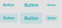
Text Button

Currently the Text Button functions as unobtrusive Idea for a place, where alot of functions are already there and has the least importance.
Disabled Button
This is an example of a disabled button. The disabled property is added on submit to prevents people from submitting their information twice by mistake while submitting a form.
Structure
Buttons can have various sizes. XS / S / SM / M / L
Guidelines
A single, primary button
As a general rule, a layout should contain a single primary button that makes it clear that other buttons have less importance in the hierarchy. This primary button commands the most attention.
Button Groups
| Alignment | Use case |
|---|---|
| Left-justified | TBD |
| Right-justified | Inline notifications, inline field buttons and data tables, forms, wizards, and single-button dialogs |
| Full-width | Dialogs, and small pop-ups, where only 1 or 2 actions are necessary |
When using multiple buttons, the position of the primary button is the most important part. To sum up, a primary button will be left-aligned and positioned to the left of the secondary/tertiary button.
If the Model is right aligned, the primary button will be right-aligned and appear to the right of the secondary/tertiary button.
Switch
2 States, changes are applied instant.
Examples
Structure
Guidelines
Cannot be used for states, in wich you need to save something.